8. Editor Controls for Post Meta
In the previous lesson we explored how meta fields are defined in the MU plugin. Now we need to build the editor UI so content editors can actually fill them in. WordPress no longer needs custom metaboxes, the block editor's SlotFill system lets us inject panels directly into the document sidebar.
Learning Outcomes
- Know how to build editor UI for meta fields using
PluginDocumentSettingPanel. - Be able to add a control that reads and writes post meta via
useEntityProp. - Understand how to scope a sidebar panel to a specific post type.
There are a lot of new additions in this lesson. To sync your theme with the finished product, run these commands and then add import './block-plugins'; to assets/js/block-extensions.js.
Run npm run build when you are complete.
mkdir -p themes/10up-block-theme/assets/js/block-plugins
cp themes/fueled-movies/assets/js/block-plugins/index.js themes/10up-block-theme/assets/js/block-plugins/index.js
cp themes/fueled-movies/assets/js/block-plugins/movie-meta-fields.js themes/10up-block-theme/assets/js/block-plugins/movie-meta-fields.js
cp themes/fueled-movies/assets/js/block-plugins/person-meta-fields.js themes/10up-block-theme/assets/js/block-plugins/person-meta-fields.js
mkdir -p themes/10up-block-theme/assets/js/block-components/PostMeta
cp themes/fueled-movies/assets/js/block-components/DateTimePopover.js themes/10up-block-theme/assets/js/block-components/DateTimePopover.js
cp themes/fueled-movies/assets/js/block-components/PostMeta/*.js themes/10up-block-theme/assets/js/block-components/PostMeta/
Architecture
The fueled-movies theme registers two sidebar panels - one for Movie fields, one for Person fields - using WordPress's plugin registration system. Each panel renders reusable components from assets/js/block-components/PostMeta/.
assets/js/
├── block-plugins/
│   ├── index.js                    ← aggregator
│   ├── movie-meta-fields.js        ← Movie sidebar panel
│   └── person-meta-fields.js       ← Person sidebar panel
├── block-components/
│   └── PostMeta/
│       ├── MovieIMDBID.js           ← IMDB ID text field
│       ├── MovieMPARating.js        ← MPA Rating dropdown
│       ├── MoviePlot.js             ← Plot textarea
│       ├── MovieReleaseYear.js      ← Release year
│       ├── MovieRuntime.js          ← Runtime hours/minutes
│       ├── MovieViewerRating.js     ← Viewer rating display
│       ├── MovieViewerRatingCount.js
│       ├── MovieTrailerID.js        ← IMDB Trailer ID
│       ├── PersonBiography.js       ← Biography textarea
│       ├── PersonBirthplace.js      ← Birthplace text field
│       ├── PersonBorn.js            ← Birth date picker
│       ├── PersonDeathplace.js
│       ├── PersonDied.js            ← Death date picker
│       └── PersonIMDBID.js
These files are loaded via block-extensions.js (the editor-only entry point), which imports ./block-plugins.
The sidebar panel
Here's the complete Movie sidebar panel:
import { Flex } from '@wordpress/components';
import { PluginDocumentSettingPanel } from '@wordpress/editor';
import { __ } from '@wordpress/i18n';
import { registerPlugin } from '@wordpress/plugins';
import { usePost } from '@10up/block-components';

import MovieIMDBID from '../block-components/PostMeta/MovieIMDBID';
import MoviePlot from '../block-components/PostMeta/MoviePlot';
import MovieMPARating from '../block-components/PostMeta/MovieMPARating';
import MovieReleaseYear from '../block-components/PostMeta/MovieReleaseYear';
import MovieRuntime from '../block-components/PostMeta/MovieRuntime';
import MovieViewerRating from '../block-components/PostMeta/MovieViewerRating';
import MovieViewerRatingCount from '../block-components/PostMeta/MovieViewerRatingCount';
import MovieTrailerID from '../block-components/PostMeta/MovieTrailerID';

const MovieFields = () => {
    const { postType } = usePost();

    if (postType !== 'tenup-movie') {
        return null;
    }

    return (
        <PluginDocumentSettingPanel
            name="tenup-movie-fields"
            title={__('Movie Information', 'tenup')}
        >
            <Flex direction="column">
                <MovieIMDBID />
                <MovieTrailerID />
                <MovieReleaseYear />
                <MovieMPARating />
                <MovieRuntime />
                <MovieViewerRating />
                <MovieViewerRatingCount />
                <MoviePlot />
            </Flex>
        </PluginDocumentSettingPanel>
    );
};

registerPlugin('tenup-movie-fields', {
    render: MovieFields,
});
Key patterns:
- Post type scoping -
usePost()from@10up/block-componentsgives us the current post type. Returnnullif it doesn't match, the panel simply won't render. PluginDocumentSettingPanel- This is the SlotFill that injects a panel into the document sidebar. Thenamemust be unique, andtitleis displayed as the panel header.registerPlugin- Registers the component as a plugin with the block editor. This is how WordPress knows to render it.- One component per field - Each meta field has its own component, keeping things modular and testable.
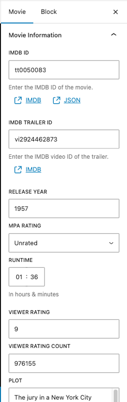 Our Movie Information meta panel
Meta field components
Each component follows a consistent pattern using PostMeta from @10up/block-components. Here's the MPA Rating dropdown:
import { __ } from '@wordpress/i18n';
import { SelectControl } from '@wordpress/components';
import { PostMeta } from '@10up/block-components';

const MovieMPARating = ({ postMetaProps, ...restProps }) => {
    const options = Object.entries(TenupMovieMPARating.options).map(([key, value]) => ({
        label: value,
        value: key,
    }));

    return (
        <PostMeta metaKey="tenup_movie_mpa_rating" {...postMetaProps}>
            {(meta, setMeta) => (
                <SelectControl
                    label={__('MPA Rating', 'tenup')}
                    value={meta}
                    options={options}
                    onChange={(value) => setMeta(value)}
                    __next40pxDefaultSize
                    __nextHasNoMarginBottom
                    {...restProps}
                />
            )}
        </PostMeta>
    );
};
The PostMeta component from @10up/block-components wraps useEntityProp and provides the current meta value and a setter function as render props.
If you're not using @10up/block-components (but why wouldn't you? 😉 ), the equivalent vanilla pattern is:
import { useEntityProp } from '@wordpress/core-data';
import { useSelect } from '@wordpress/data';

const MyMetaField = () => {
    const postType = useSelect((select) => select('core/editor').getCurrentPostType());
    const [meta, setMeta] = useEntityProp('postType', postType, 'meta');
    const value = meta?.tenup_movie_tagline ?? '';
    const onChange = (newValue) => setMeta({ ...meta, tenup_movie_tagline: newValue });

    return (
        <TextControl
            label="Tagline"
            value={value}
            onChange={onChange}
        />
    );
};
Complex meta: MovieRuntime
The runtime field demonstrates a more complex component - it stores an object with hours and minutes properties:
import { __ } from '@wordpress/i18n';
import { BaseControl, TimePicker } from '@wordpress/components';
import { PostMeta } from '@10up/block-components';

const MovieRuntime = ({ postMetaProps, ...restProps }) => {
    return (
        <PostMeta metaKey="tenup_movie_runtime" {...postMetaProps}>
            {(meta, setMeta) => (
                <BaseControl
                    id="tenup-movie-runtime"
                    label={__('Runtime', 'tenup')}
                    help={__('In hours & minutes', 'tenup')}
                >
                    <TimePicker.TimeInput
                        onChange={(value) => {
                            setMeta({
                                hours: String(value.hours),
                                minutes: String(value.minutes),
                            });
                        }}
                        value={meta}
                        {...restProps}
                    />
                </BaseControl>
            )}
        </PostMeta>
    );
};
Because the PHP MovieRuntime field is registered as type object with hours and minutes properties, the setMeta call passes a matching object shape.
Reusable components: DateTimePopover
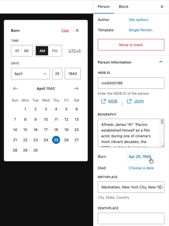
The Person post type has born and died date fields. Rather than building a date picker from scratch, we reference existing Gutenberg editor UI and recreate a similar experience.
Look at how WordPress renders the post publishing date in the document sidebar. It uses a PostPanelRow layout with an InspectorPopoverHeader inside a dropdown. Our DateTimePopover component follows the same pattern using the same class names (editor-post-panel__row-label, block-editor-inspector-popover-header) so it visually matches the core UI.
const DateTimePopover = ({ date, setDate, label }) => {
    return (
        <Dropdown
            style={{ width: '100%' }}
            popoverProps={{ offset: 36, placement: 'left-end' }}
            renderToggle={({ isOpen, onToggle }) => (
                <HStack justify="flex-start" alignment="top">
                    <div className="editor-post-panel__row-label">{__(label, 'tenup')}</div>
                    <Button
                        aria-expanded={isOpen}
                        onClick={onToggle}
                        size="compact"
                        variant="tertiary"
                    >
                        {date ? formatDate(date) : __('Choose a date', 'tenup')}
                    </Button>
                </HStack>
            )}
            renderContent={({ onClose }) => (
                <div style={{ padding: '16px' }}>
                    <HStack
                        justify="space-between"
                        className="block-editor-inspector-popover-header"
                    >
                        <Heading level={2} size={13}>
                            {__(label, 'tenup')}
                        </Heading>
                        <HStack
                            justify="flex-end"
                            align="center"
                            style={{ 'max-width': 'fit-content' }}
                        >
                            <Button
                                onClick={() => setDate('')}
                                size="small"
                                variant="link"
                                isDestructive
                            >
                                {__('Clear', 'tenup')}
                            </Button>
                            <Button
                                size="small"
                                className="block-editor-inspector-popover-header__action"
                                label={__('Close', 'tenup')}
                                icon={closeSmall}
                                onClick={onClose}
                            />
                        </HStack>
                    </HStack>
                    <DateTimePicker
                        label={__(label, 'tenup')}
                        onChange={setDate}
                        currentDate={date}
                        is12Hour
                    />
                </div>
            )}
        />
    );
};
The key technique here is borrowing class names from core's existing UI rather than importing internal components. The editor-post-panel__row-label class gives us the same label styling as the post status row, and block-editor-inspector-popover-header gives us the same popover header layout. This way our date picker feels native to the editor without depending on unstable internal APIs.
A field component like PersonBorn.js then just wraps our DateTimePopover with the right meta key:
const PersonBorn = ({ postMetaProps, ...restProps }) => {
    return (
        <PostMeta metaKey="tenup_person_born" {...postMetaProps}>
            {(meta, setMeta) => (
                <DateTimePopover
                    label={__('Born', 'tenup')}
                    date={meta}
                    setDate={(value) => setMeta(value)}
                    {...restProps}
                />
            )}
        </PostMeta>
    );
};
This sort of reverse engineering is not strictly necessary, but it does provide a cohesive editorial experience.
While this example required a more manual approach, the full documentation for components and other items can be found in the Gutenberg Storybook
Tasks
Walk through 2-3 examples
Students don't need to create each field by hand. The pattern repeats. Walk through these examples to understand how it works:
-
The panel registration pattern. Open
movie-meta-fields.js. Identify theregisterPlugincall, thePluginDocumentSettingPanel, the post type check viausePost(), and how field components are composed inside aFlex. -
A simple text field. Open one
PostMetacomponent (e.g.MoviePlot.jsorMovieIMDBID.js). See how the@10up/block-componentsPostMetarender prop pattern works vs the vanillauseEntityProphook shown above. Both are valid approaches. -
A more advanced control. Open
PersonBorn.js. This shows a reusable shared component (DateTimePopover.js) usingDropdown+DateTimePicker, and how to format/parse date strings for meta storage.
After the walkthrough, explore the remaining components on your own. The pattern repeats.
Bonus: Create your own meta field
To re-enforce what you've learned in the last lesson and here, try and create your own unique field!
Feeling stuck?
- Copy one of the PostMeta files in
/mu-plugins/10up-plugin/src/PostMeta/such asMoviePlot.phptoMyCoolMetaField.php - Change the
MoviePlotclass name and use a uniqiueMETA_KEYslug -my_cool_meta_field - Copy the
/themes/fueled-movies/assets/js/block-components/PostMeta/MoviePlot.jsfile toMyCoolMetaField.js - Change the
MoviePlotname and export, and swap the meta key in the<PostMeta/>component formy_cool_meta_field - Add the import and place your new component below the
<MoviePlot/>component in/themes/fueled-movies/assets/js/block-plugins/movie-meta-fields.js - Run
npm run buildand see your new component in the editor! Add a value, save, and refresh to confirm the value persists. - Check the REST API response at
/wp-json/wp/v2/tenup-movie/{id}to see your new value there.
Ship it checkpoint
- A document panel appears only for the intended post type
- Editing a field updates post meta and persists after refresh
Takeaways
- Use
PluginDocumentSettingPanel, not custom metaboxes. useEntityPropis the standard hook for reading/writing post meta in the editor. ThePostMetacomponent from@10up/block-componentswraps it with a cleaner API.- Scope panels to the correct post type by checking
postTypeand returningnullif it doesn't match. - Keep meta components small, one component per field.
- Complex meta (objects, arrays) works the same way. The shape passed to
setMetamust match the REST schema.